A map made from the names.
Condensed light lettering sits inside solid dark neighborhood shapes. The names fill their areas in horizontal or vertical rows, with straight letterforms and narrow gaps between places. It is a good starting point when the neighborhood names matter as much as the streets.
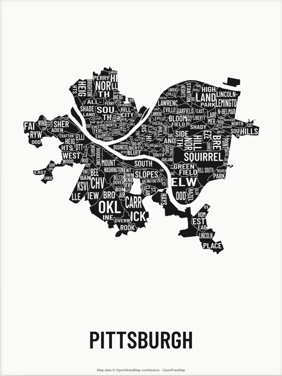
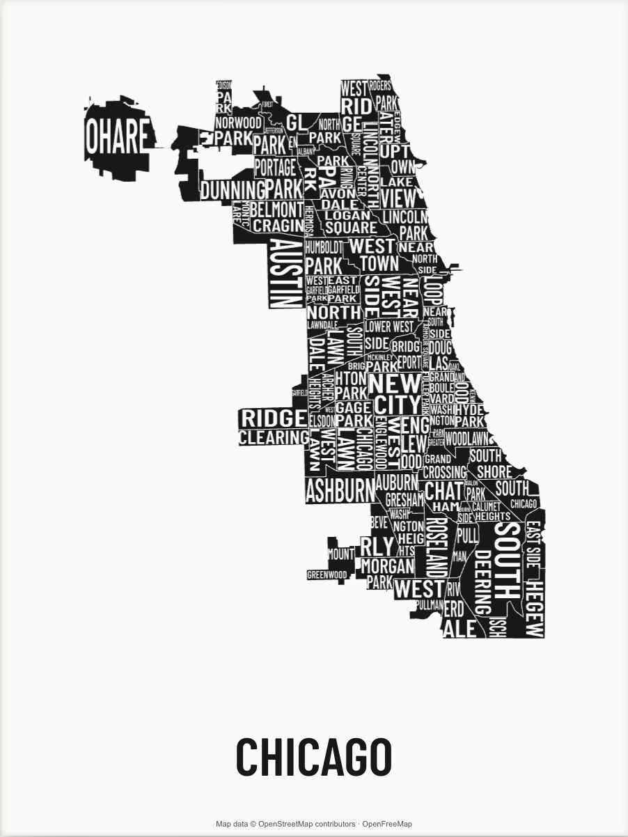
Start with a place we can map clearly.
The studio has bundled area data for Pittsburgh, Chicago, Cleveland, New York, and Paris. Each source defines its areas differently. Chicago uses community areas; New York uses statistical neighborhood areas; Paris uses quartiers.
Give the lettering enough room.
Long names and narrow shapes need space. Start with the crop you want, inspect the lettering, and compare print sizes. Moving very close can cut a name at the edge of the paper; moving far out can make the smaller areas difficult to read.
You can change the palette, composition, and title around the map. The underlying area names come from the map source. This style leaves out roads and water fills. Thin gaps keep adjoining areas separate.
Try the typography style ↗Prints from $59 · Free shipping in the contiguous US and DC
Prefer a map with more geographic detail? Compare the street-map style.